Code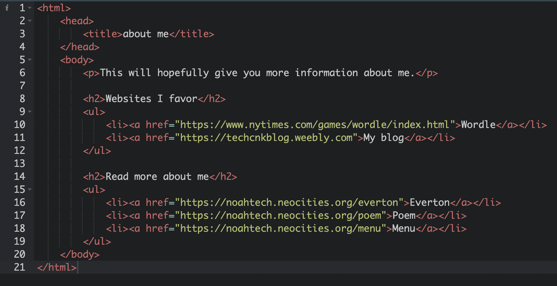 Webpage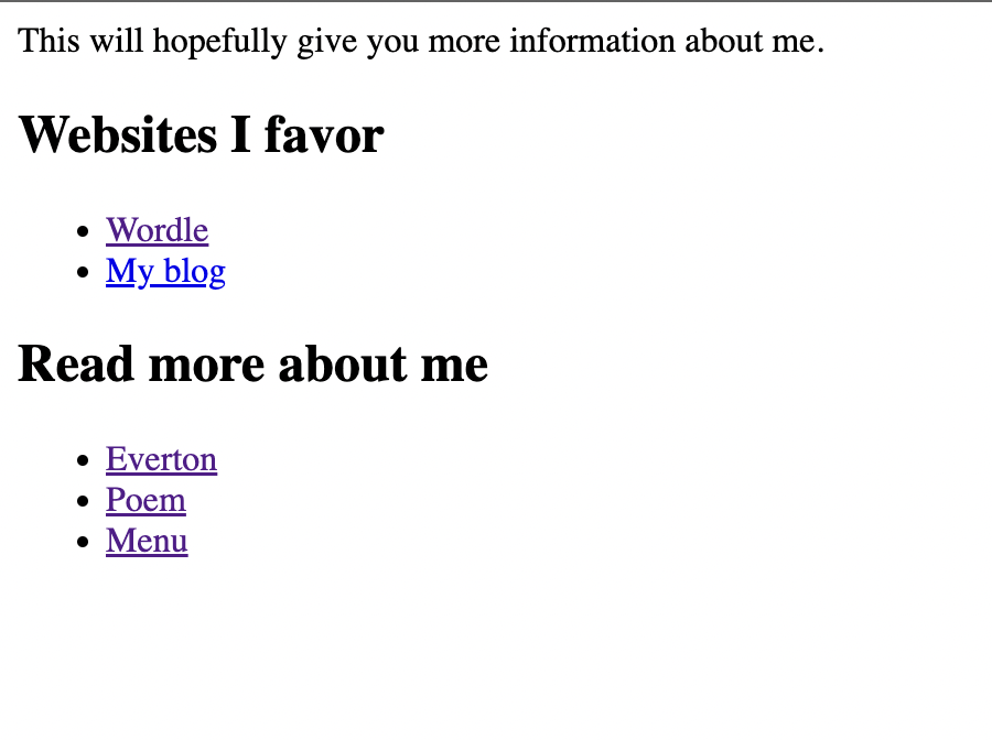 ExperienceThis was a pretty good experience, I learned how to paste links into my HTML.
noahtech.neocities.org/
0 Comments
Code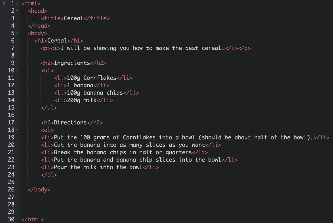 Webpage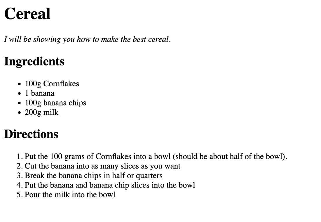 ExperienceI had a great experience doing this assignment. It helped me get creative and learn more about coding. This assignment is a webpage assignment because we code to make webpages on Neocities.
noahtech.neocities.org/menu Webpage Code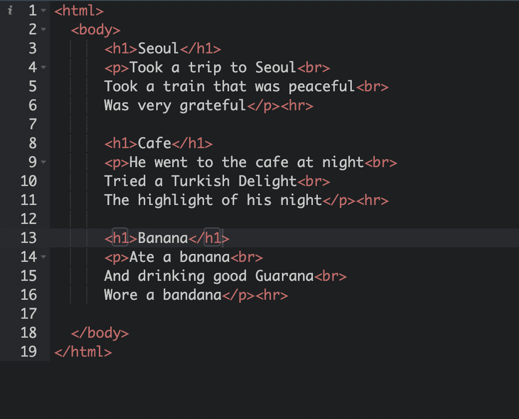 ExperienceThis project allowed me to be more creative, like creating my own poems. I think this project was interesting, trying to make poems and at the same time code. This project helped me learn more about coding and poems.
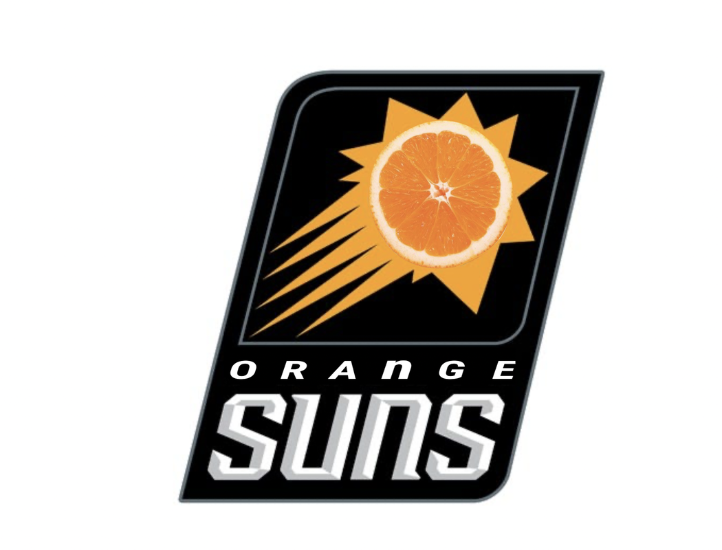
noahtech.neocities.org/poem For this summative, I was supposed to make a logo. I was supposed to make 9 logos on Corel Vector. The most frustrating part when I was making the logos was the time. I spent too long trying to make perfect logos that I did not have much time to edit and revise. My favorite part of the project was designing and coloring the logo. Something I learned from this project is that making a logo is not easy. 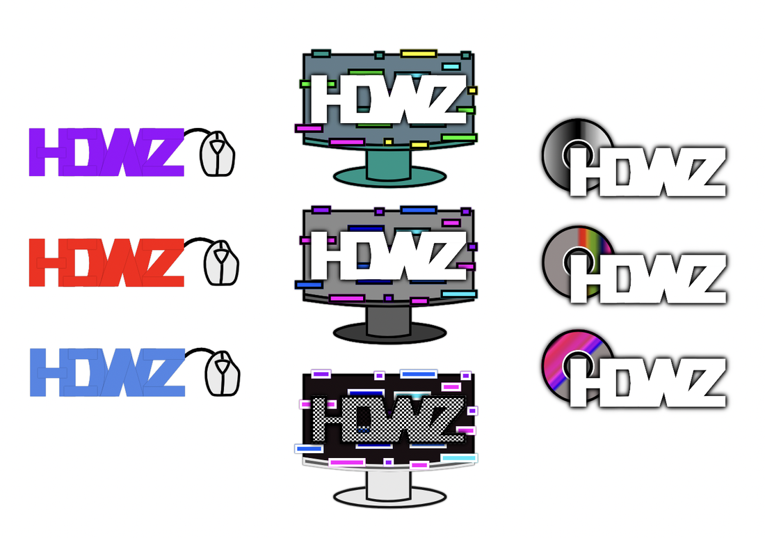 Hardwarez (also known as HDWZ) was a logo I created because of my love for Hardware. The purpose of this brand is to be able to sell quality hardware for a great and reasonable price. This logo really represents our brand because we sell a lot of hardware items, including CDs (shown in the logo). There were 2 logos that I really liked (The middle one and the middle second one). I think CDs look really cool because of reflection that happens on the CD (which shows all the colors of the rainbow) so I chose that one. Some things that were really important during the process was having a sketch of the logo, which then I traced and revised the logo.  This logo was designed for a brand I came up with called HDWZ. Out of the 3 logos, I chose the logo that had a HDWZ logo with a pc on it, HDWZ logo with a CD next to it, and a HDWZ logo with a mouse on it on the right. These 3 logos represent and symbolize the HDWZ we sell, just really gives a clear representation of our brand. I liked those 3 I selected because they really present what our brand is and sells. The other ones like the one I wrote in cursive doesn't represent or show what our brand is in any way. The process was fun, I got to be very creative with my logos, it was a great experience trying to make new logos and I learned a lot from it. 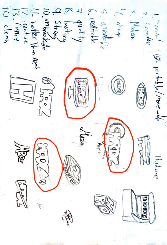 For these assignments, I was supposed to make designs on Corel Vector. I had to fill the designs with specific color types. I made them by using shapes and editing it with tools like “convert to path”. I also used Adobe Color to find the color scheme I wanted to make. Adobe color allows you to choose the color scheme you want to use, and then just selected the color schemes you want on the color wheel. Some challenges I faced while doing these assignments were stuff like making the actual model/design. I overcame the challenges by using many types of tools to make it look more like the model I tried to replicate. Some things I succeeded on were the actual design. I think I made the design similar to the image I wanted to replicate. I am proud of my design, I guess, but I have a feeling I could have done better. Not only that, but I used tools like shapes and edited it with covert to path. I really wanted to replicate the FIFA World Cup. My favorite color scheme is monochromatic because it is simple, but I like all the color schemes. Color Names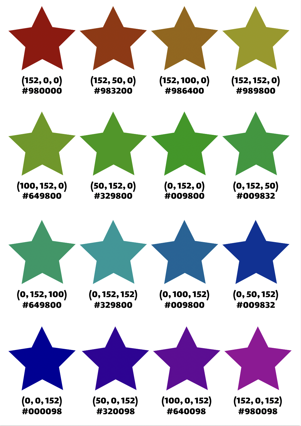 Color Schemes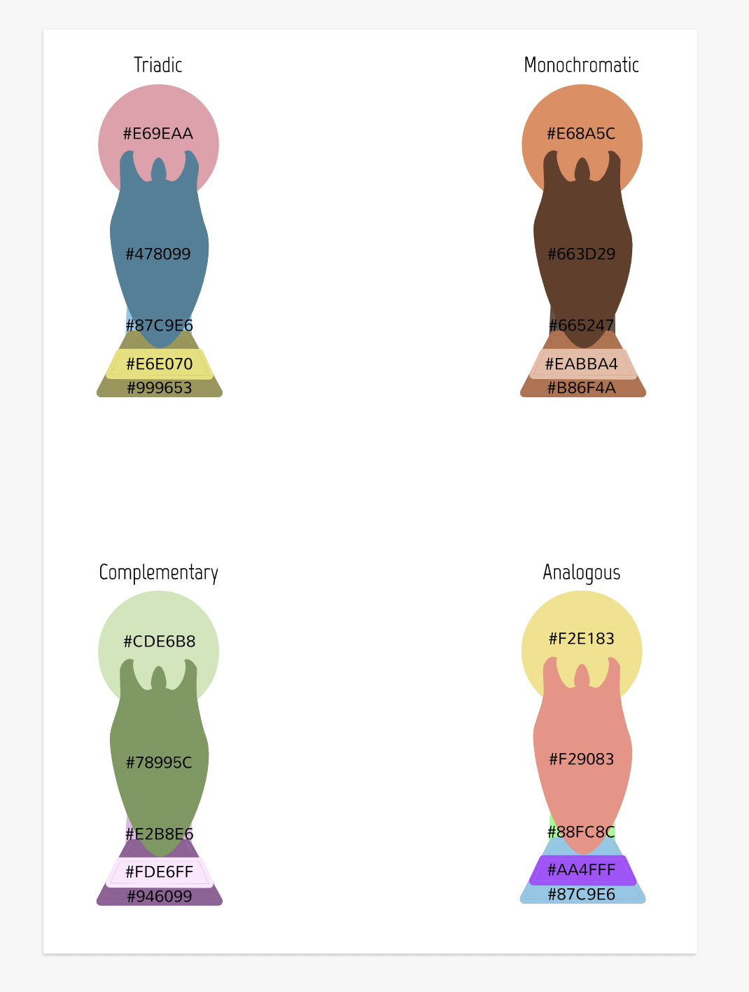 Typography is the font, style, color, and alignment used for a circumstance. Typography is important because there are situations where the font, style, alignment, and color is appropriate and inappropriate. The quote “Each font has a personality and a purpose” is saying that each font is supposed to be used in a way where it fits the theme. It also means all fonts have different personalities, which also means they all fit in different themes. The 5 types of fonts we learned in class are serif, sans serif, handwritten, monospaced, and display. A serif font is a font with serifs on the font. The characteristics of the font are old, roman, and formal. It is usually used in school essays, documents, and reports. A sans serif font is a font with no serifs, very clean and neat. The characteristics of a sans serif font is neat, clean, and modern. It is sometimes used in signs, especially road signs. A handwritten font is literally just a font that looks like it is handwritten. Some characteristics for a handwritten font is realistic and hard to read. It might be used when making a card or a message to a friend. A monospaced font is a font in which the letters/symbols/keys have exactly the same amount of space between each other. A characteristic for a monospaced font is organized. Monospaced fonts are used in newspapers. Finally, a display font is a font that looks fancy and very different from the others. A characteristic for a display font is fancy and creative. Display fonts are used for headings, usually large texts. Typeface ComparisonFor this assignment, I had to make a A4 sized document that presented the 5 types of fonts we learned in class (Serif, Sans Serif, Handwritten, Monospaced, and Display). I had to create a phrase or sentence which was used for all the fonts. I chose 1 font for the 5 types of font. I was also told to follow the CRAP principles, so it looked more neat and organized. 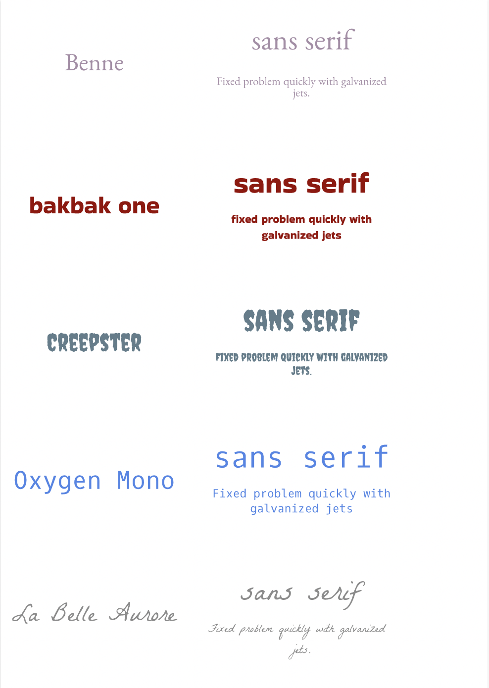 Word PortraitsFor the Word Portraits assignment, I had to use 10 fonts and 20 words. I labeled each font with the font name, as it said in the instructions. I had to use 2 words for each font, one was supposed to relate to font and the other one had to be a sarcastic word for the font. Finally, I had to follow the CRAP design principles to make the design look neat and organized. 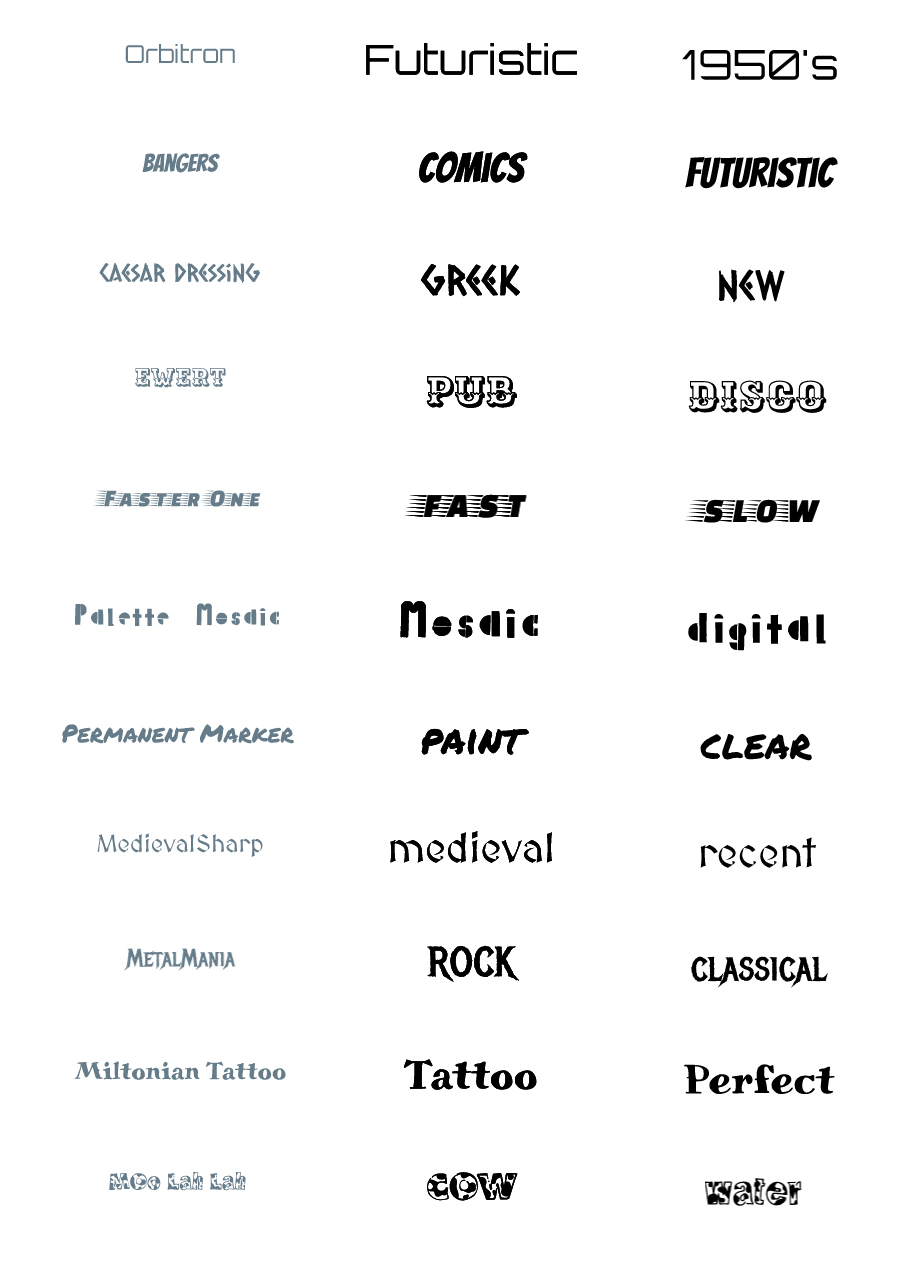 For drawing with code, I made an IPhone with code. This design is made with rectangles and ellipses each piece with a different color to form an IPhone. I made this artwork because coding makes me think of technology like computers and I use an IPhone so I made one with code. This is a tutorial that helped me make this design. Khan 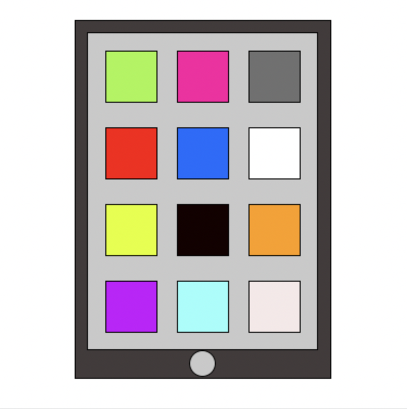 ///layer
|
  |   |
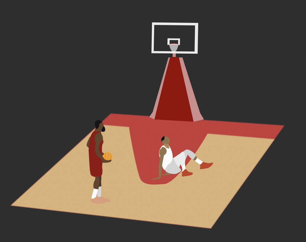
Well, I learned how to make vector images. I made a scene of Harden doing this other dude bad. I am a fan of basketball, and I like when players use skills. I think its entertaining when Harden goes 1 on 1 with a player.
Archives
May 2023
April 2023
March 2023
February 2023
December 2022
November 2022
October 2022
September 2022
 RSS Feed
